As spring arrives, we’re seeing some fresh approaches to how contractor websites look and work. It’s more than just making things pretty; it’s about making sites that work better for both the contractor and the customer. We’ve put together some of the top contractor website design trends we’re noticing this season, focusing on what makes a site effective and easy to use. Let’s take a look at what’s new and how it can help businesses connect with clients.
Key Takeaways
- Simple color schemes and clean layouts are popular for contractor websites, making them easy on the eyes and simple to find information.
- Using clear images and easy-to-read text helps people quickly understand what a contractor does and if they are the right fit.
- Making sure a website works well on phones is a big deal, as many people look for services on their mobile devices.
1. Pastel Color Palettes
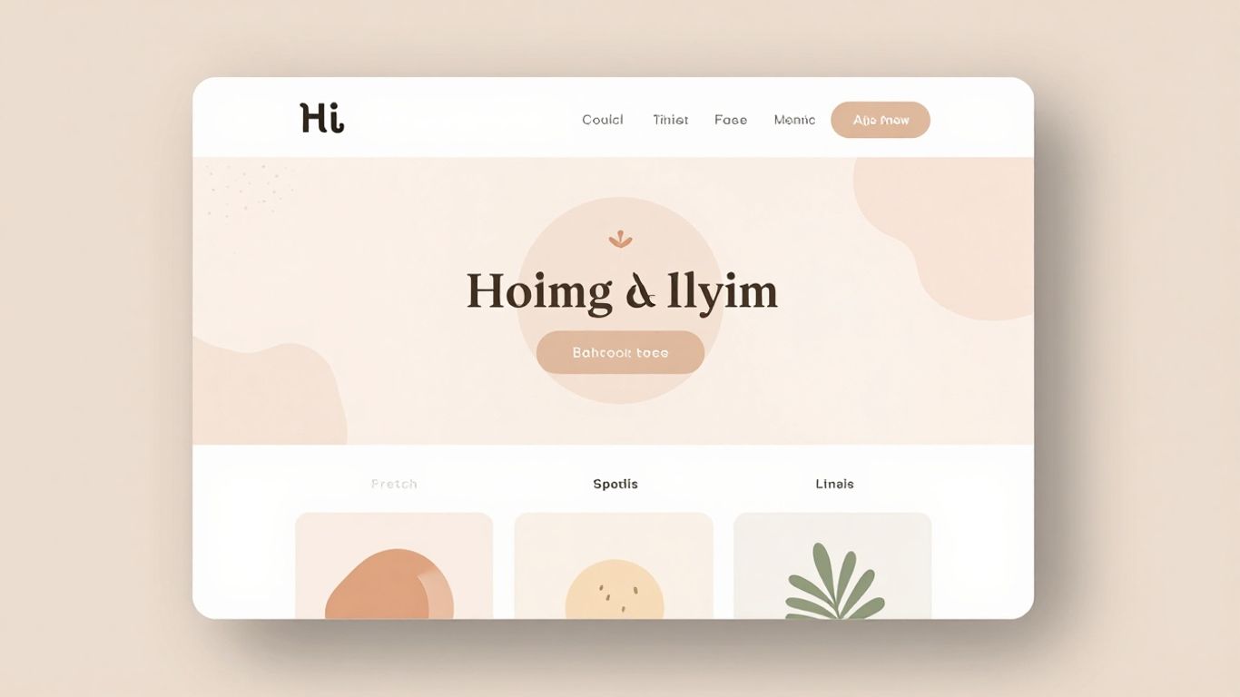
We’re seeing a real shift towards softer, more approachable color schemes on contractor websites this spring. Think less harsh corporate blues and more gentle, inviting tones. Pastel color palettes are making a big comeback, and for good reason. They create a sense of calm and professionalism without feeling stuffy.
These lighter shades, like soft mint green, pale peach, or a muted lavender, can really make a website feel fresh and modern. It’s a subtle way to signal trustworthiness and a friendly approach to business. Instead of a stark white background, imagine a website with a very light, almost imperceptible pastel hue. This can make the content easier on the eyes and give the whole site a more welcoming vibe.
Here’s why we think this trend is sticking around:
- Softer Visuals: Pastels reduce visual clutter and make the overall design feel less aggressive.
- Approachable Brand Image: They convey a sense of care and attention to detail, which is great for service-based businesses.
- Versatility: These colors pair well with bolder accent colors for calls to action, making them stand out.
We’ve noticed that using a pastel palette doesn’t mean sacrificing clarity. It’s all about finding the right balance. A light background with darker, readable text works wonders. It’s a smart way to make your site feel contemporary and inviting, especially when people are looking for someone to trust with their home projects.
This trend is a departure from the high-contrast, sometimes overwhelming designs we’ve seen. It’s about creating a digital space that feels as comfortable and reliable as the services you provide.
2. Asymmetrical Layouts
We’ve noticed more contractor websites moving away from safe, traditional grids. Instead, there’s a real push towards layouts that feel less structured and more organic. Asymmetrical designs help us guide the visitor’s eye through the page in a way that feels both modern and unexpected. It breaks up the monotony, making each section more interesting to scroll through.
Some of the main benefits of shifting to an asymmetrical layout include:
- Unique visual flow that keeps people scrolling longer
- Easier highlight of specific projects, calls to action, or awards
- Opportunity to show some personality on an otherwise straightforward site
When we rethink balance on a page, we give our websites a bit more attitude and draw our clients’ attention to what truly matters most.
We’ve tested these layouts and found they work best for companies willing to take a small risk with their online look. Not every client is ready for it, but the ones who are tend to stand out quickly in a crowded field.
3. Microinteractions
We’ve been seeing a lot more microinteractions on contractor websites lately, and honestly, they make a big difference. These aren’t the big flashy animations; they’re the small, subtle things that happen when you do something on a site. Think about clicking a button and it slightly changes color, or hovering over a service and a little icon pops up. They add a layer of polish that makes the whole experience feel more responsive and professional.
These little touches do more than just look nice. They give users feedback, letting them know their action was registered. This can be anything from a button confirming a form submission to a subtle animation when a menu item is selected. It’s about making the digital interaction feel more natural, almost like talking to someone who acknowledges your input.
Here are a few examples we’ve noticed:
- A button that subtly changes shape or color when clicked.
- A loading spinner that’s more engaging than a plain circle.
- Hover effects on service icons that reveal more information.
- Form fields that provide immediate visual cues for correct or incorrect input.
These small details can significantly improve user satisfaction and guide visitors through the site more intuitively. It’s like the difference between a website that just sits there and one that feels alive and helpful. We think this trend is here to stay because it just makes sense for creating a better user experience.
4. Bold Typography
We’re seeing a big shift towards using typography not just for readability, but as a main design element. Think big, chunky fonts that grab attention right away. This trend is all about making a statement and conveying confidence. It’s a way to quickly communicate the contractor’s brand personality – whether that’s strong and reliable, or modern and innovative.
Using bold typefaces can really help break up the visual space on a page. It guides the visitor’s eye to the most important information. We’ve found that certain font pairings work particularly well:
- A strong, sans-serif font for headings paired with a clean, readable serif for body text.
- Using different weights within the same font family to create hierarchy.
- Incorporating display fonts for specific calls to action or key service highlights.
This approach isn’t just about making text look good; it’s about making it functional. When done right, it makes the website feel more dynamic and less like a static brochure. It’s a simple change that can have a big impact on how visitors perceive the company.
We’ve noticed that websites using bold typography often feel more memorable. It’s like the text itself has a personality, which can make a contractor’s site stand out in a crowded market. This isn’t about being loud for the sake of it, but about using type to communicate strength and clarity.
5. Full-Screen Hero Images
We’ve seen a big shift towards using full-screen hero images on contractor websites, and it’s easy to see why. These large, impactful visuals immediately grab a visitor’s attention the moment they land on the homepage. They set the tone and give a strong first impression of the company’s work and professionalism.
Think about it: when someone searches for a contractor, they want to see the quality of work. A high-resolution image of a completed project – maybe a stunning kitchen remodel or a beautifully landscaped yard – speaks volumes more than a block of text ever could. It’s a visual promise of what you can do for them.
Here’s why we’re seeing more of this trend:
- Immediate Impact: Captures attention right away.
- Showcases Work: Lets your best projects speak for themselves.
- Builds Trust: Professional imagery suggests a professional company.
- Sets Expectations: Gives visitors a clear idea of your style and quality.
We find that the type of image matters a lot. It should be relevant to the services offered and high quality. Blurry or generic stock photos just won’t cut it anymore. We want to see real projects, real results.
When choosing a hero image, consider what message you want to send. Is it about luxury renovations, practical home repairs, or eco-friendly solutions? The image should align perfectly with your brand and target audience. It’s not just a picture; it’s a statement.
6. Parallax Scrolling
We’ve seen parallax scrolling pop up more and more on contractor websites, and it’s easy to see why. It’s that effect where background images move slower than foreground content as you scroll down the page. This creates a really cool sense of depth and makes the website feel more dynamic. It’s not just about looking pretty, though. When done right, it can guide the visitor’s eye through your content in a more engaging way. Think about showing off a project: the background might be a subtle shot of the finished exterior, while the text detailing the work scrolls over it. It adds a layer of professionalism that can really make a business stand out.
Here’s how we’re seeing it used effectively:
- Showcasing Services: Imagine scrolling through a list of services, and with each one, a relevant background image subtly shifts, giving context without being distracting.
- Project Spotlights: As users scroll through case studies, different elements of the project (like before/after shots or key features) can appear to move at different speeds.
- About Us Sections: A background image of your team or a past job site can create a more personal connection as the text about your company’s history scrolls over it.
It’s a technique that requires a bit of careful planning to get right. Too much movement or poorly optimized images can actually slow down a site or become annoying. But when it’s subtle and supports the content, it’s a fantastic way to add a bit of wow factor.
We’ve found that the best parallax effects are the ones you barely notice consciously, but they leave you with a feeling that the site was well-crafted and modern. It’s about adding polish, not just motion for motion’s sake.
7. Custom Illustrations
We’re seeing a big shift away from generic stock photos on contractor websites. Instead, many are opting for custom illustrations. These aren’t just pretty pictures; they’re a way to show off a company’s unique personality and style. Think about it – a hand-drawn graphic of a house being built or a quirky character representing your team can make a site feel much more personal and approachable.
Custom illustrations help build trust and make your brand memorable. They can simplify complex services, like explaining your warranty process with a visual flow. Plus, they give your site a distinct look that stands out from competitors who are all using the same tired images. It’s about creating a visual language that speaks directly to your ideal client.
Here’s why they work so well:
- Uniqueness: No one else will have the same graphics.
- Brand Personality: They can reflect your company’s vibe, whether it’s modern, traditional, or playful.
- Clarity: Visuals can explain services or processes more easily than text alone.
- Engagement: Interesting illustrations can keep visitors on your site longer.
We’ve noticed a trend where these illustrations are often used in a minimalist style, using simple lines and a limited color palette that matches the overall site design. This keeps the focus on the message without being overwhelming. It’s a smart way to add character and professionalism.
8. Mobile-First Navigation
We all get it—everyone seems glued to their phone these days, us included. Contractor websites need to look good and work smoothly on mobile screens first, not as an afterthought. If people have to pinch and zoom or hunt for a menu, they’ll probably just leave.
Mobile-first navigation isn’t just about moving a menu button to the top corner. It’s about making every tap, swipe, and scroll as simple as possible. We’ve noticed several clear patterns that make life easier for visitors:
- Slide-out menus that tuck away when not needed, keeping the screen clean
- Simple icons (like a clear home or phone icon) so users know exactly where to tap
- Finger-friendly buttons with enough space between them
Accessibility matters here, too. We always try to use font sizes and button shapes that work for all hands and eyes, not just the young or tech-savvy.
The best navigation is invisible—users move through the site without having to think about where to go next.
It feels good when a site just… works on a phone, doesn’t it? We aim to make our navigation simple to use, because that’s what everyone expects now.
9. Interactive Project Galleries
Interactive project galleries are quickly becoming one of the most talked-about features on contractor websites this season. We see that letting visitors click or tap through completed jobs gives them much more than the usual static photos. Instead of scrolling through endless grids, people get to filter, zoom, and even look at before-and-after comparisons. It’s a way to show our results without overwhelming folks with information.
These are the main elements we like to include in project galleries:
- Filtering by category, such as kitchen remodels, exterior work, or additions.
- Hover effects or lightboxes for a closer look at project images.
- Short descriptions, so visitors know what they’re seeing and what made each project unique.
- Sometimes, a slider for before-and-after shots helps tell a quick story about the job.
Visitors usually spend more time on our sites when we use interactive galleries. It makes the work feel real and present, not just another set of stock images.
Building a gallery like this doesn’t require fancy technology, but it does take a bit more effort when organizing photos and writing simple descriptions. The payoff? More people stay engaged—and they get a better feel for what we actually do. A small change can make our work stand out in a crowded field.
10. Sustainability Badges
We’re seeing more and more contractors highlight their commitment to eco-friendly practices, and a simple way to do that on your website is with sustainability badges. These aren’t just pretty icons; they’re quick visual cues for potential clients who care about the environment. Think of them as trust signals for the green-minded consumer.
These badges can represent a variety of things. Maybe your company uses recycled materials, minimizes waste on job sites, or specializes in energy-efficient installations. Whatever it is, make sure the badge accurately reflects your actual practices. It’s not about just looking good; it’s about being transparent.
Here are a few ideas for what these badges could signify:
- Use of recycled or sustainable building materials.
- Commitment to reducing construction waste.
- Expertise in energy-efficient upgrades (like solar or better insulation).
- Water conservation practices.
- Low-VOC (Volatile Organic Compound) product usage.
Displaying these prominently, perhaps near your contact information or on your ‘About Us’ page, can make a real difference. It shows you’re thinking about the future, not just the current project. It’s a small detail that can speak volumes about your company’s values and modern approach to construction.
Wrapping Up Our Spring Design Trends
So, that’s a look at some of the fresh ideas we’re seeing for contractor websites this spring. We’ve talked about making things easy to use, showing off your work clearly, and making sure people can find you. It’s all about making your site work for you, bringing in new customers, and showing them you’re the right choice. Think about these trends as you update your own site. A good website is like a good handshake – it makes a strong first impression. We hope this gives you some good starting points for making your online presence shine this season.
Frequently Asked Questions
Why are light colors popular for contractor websites in spring?
We see lighter, softer colors like pale blues and greens becoming popular because they remind us of springtime. These colors can make a website feel fresh and new, much like the season itself. It’s a way to signal that a contractor’s business is also ready for a refresh and new projects.
What is a ‘mobile-first’ approach to website design?
Designing for ‘mobile-first’ means we create the website with phones and tablets in mind from the very beginning. We make sure everything looks good and works well on smaller screens first, and then we adapt it for computers. This is super important because lots of people look at websites on their phones nowadays.
How do ‘interactive project galleries’ help potential customers?
Interactive galleries let visitors click through pictures and details of past work, like exploring a digital portfolio. This helps people see the quality of our work up close and imagine what we could do for them. It’s a much more engaging way to show off our skills than just a plain list of photos.